11 motion design styles for product launch videos.
Which style should you pick?
| Style | The look | Best for |
|---|---|---|
| Nightshift | Dark studio; the real UI floats as lit glass panels in depth; one accent behaves like light | SaaS, dev tools, AI products with good-looking UI |
| Keynote | Pure black stage, huge centred white type, one gradient word on the drop | One crisp idea, a memorable name, consumer apps |
| Receipt | One tactile object (a receipt, a ticket, a stamp) acted on physically beside heavy headlines | Products that remove a countable pain: money, tasks, errors |
| Thread | Warm paper, ink outlines, one coral line running through the whole film | Narrated explainers, processes, teaching |
| Canvas | White canvas; one real UI element morphs through the product's states, driven by a cursor; no cuts | Product flows, landing-page loops, one hero action |
| Blueprint | Gold line-art wireframes drawn stroke by stroke on black, archive labels | Story films, history, infrastructure, numbers |
| Silk | One soft gradient world; real screens as floating glass cards; the URL typed at the end | Consumer and fintech apps, mobile-first launches |
| Poster | Giant condensed words slam, stack, roll and correct themselves on the beat; warm paper, one loud accent | Bold launch lines, manifestos, numbers |
| Hairline | Isometric line drawings in one grey stroke; one bright edge marks what the copy names | Dev tools, infrastructure, data and AI, "how it works" |
| Reel | Movie-trailer register: graded, grainy, letterboxed shots of the real product, REC HUD, title cards | Big launches and brand moments |
| Pixel | Two pixel worlds, day and night, joined by a brand-colour dither; serif headlines resolve out of pixel blocks; the network as a pixel sphere that bursts | Networks, creators, communities, launches, agents |
What does each style look like in motion?
Canvas: one element, every state
One real control (a button, a field, a card) lives on near-white and morphs through the product's flow: button, loader, check, card. A cursor drives every change, one state per beat, and nothing cuts. It is the single most bookmarked format of the wave.
Nightshift: real UI as light
The product's real screens float as lit glass panels in a dark studio, and one accent colour behaves like light, sweeping across the panels on the beat.
Pixel: two worlds and a burst
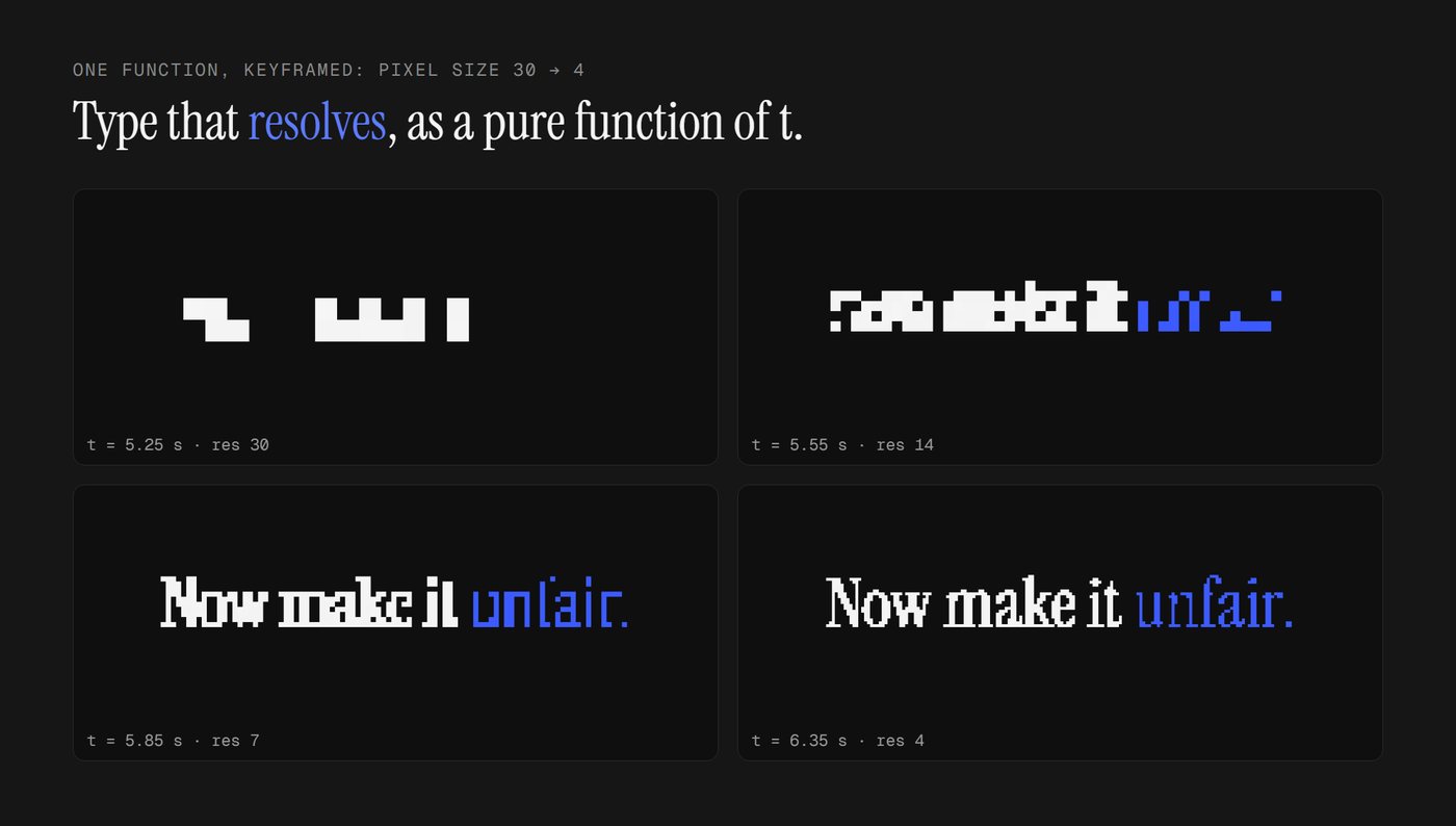
A white day world for the problem, a near-black night world where the product works, joined by a dither dissolve in the brand colour. Headlines are a real serif rendered as 1-bit pixels that sharpen from coarse blocks into crisp type, and the product's network is a sphere of pixels that assembles, turns and bursts on the climax. Built for "many at once" products.
Poster: the words are the motion
Giant condensed words slam in, stack, get crossed out and corrected, and roll to the real number on every beat, with mono spec labels and a designer's handwritten notes.
Hairline: structure as one object
The product drawn as one isometric object in a single grey line: a window that opens into its layers, pillars that rise, cards that stand up. One bright edge shows where to look.
Reel and Keynote: the event
Reel shoots the real product like a trailer (grain, letterbox, a REC timecode, title cards on the beat). Keynote strips everything back to black and one huge line.
Silk, Thread, Blueprint and Receipt
Silk is one continuous soft gradient world with floating glass cards. Thread is warm paper with one coral line through the whole film. Blueprint draws gold wireframes stroke by stroke. Receipt acts on one physical object: printed, stamped, shredded.
What do all the good ones share?
From the 74 viral films we measured, whatever the style: one world instead of slides, change that happens in place (about 2 hard cuts per 30 seconds), something always moving (under 10% still), real product UI rebuilt rather than screenshots, and real numbers set big.
Want it done for you?
TeaserKit ships all 11 styles, each with its own motion rules, a banned list and your brand's accent colour. Pick one, or let the director choose for your product.
Questions people ask
What is the most popular motion design style for launch videos?
By views in the 2026 AI-motion wave: the cinematic trailer look with grain and a REC HUD (about 17M views across films), the gold wireframe documentary look (about 14M), the dark showreel with one accent (about 1.9M), warm illustrated paper (1.27M) and the one-element UI morph on white (970K, the most bookmarked).
Which style is best for a SaaS product?
If the product has a clear UI flow, Canvas (one real control morphing through its states, driven by a cursor) or Nightshift (real screens as lit panels on dark). For infrastructure and developer tools, Hairline.
Which style works best in 9:16 vertical?
Silk was designed mobile-first; Canvas and Poster also hold up well because they keep one subject in the centre column.
Can I use my brand colours?
Yes. In TeaserKit each house style keeps its palette and takes your brand's accent colour, so the light in the scene changes with your brand; your logo and captured UI carry the rest.